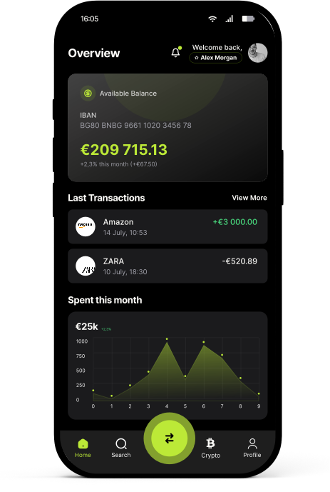
Smart Banking,
Made Simple.
Designing a unified financial experience that replaces fragmented banking tools with one clean, dark-native mobile app - from onboarding to live market data.
A modern banking app that makes managing your money effortlessly simple - from account management to live market data.
Every screen crafted for clarity & speed.
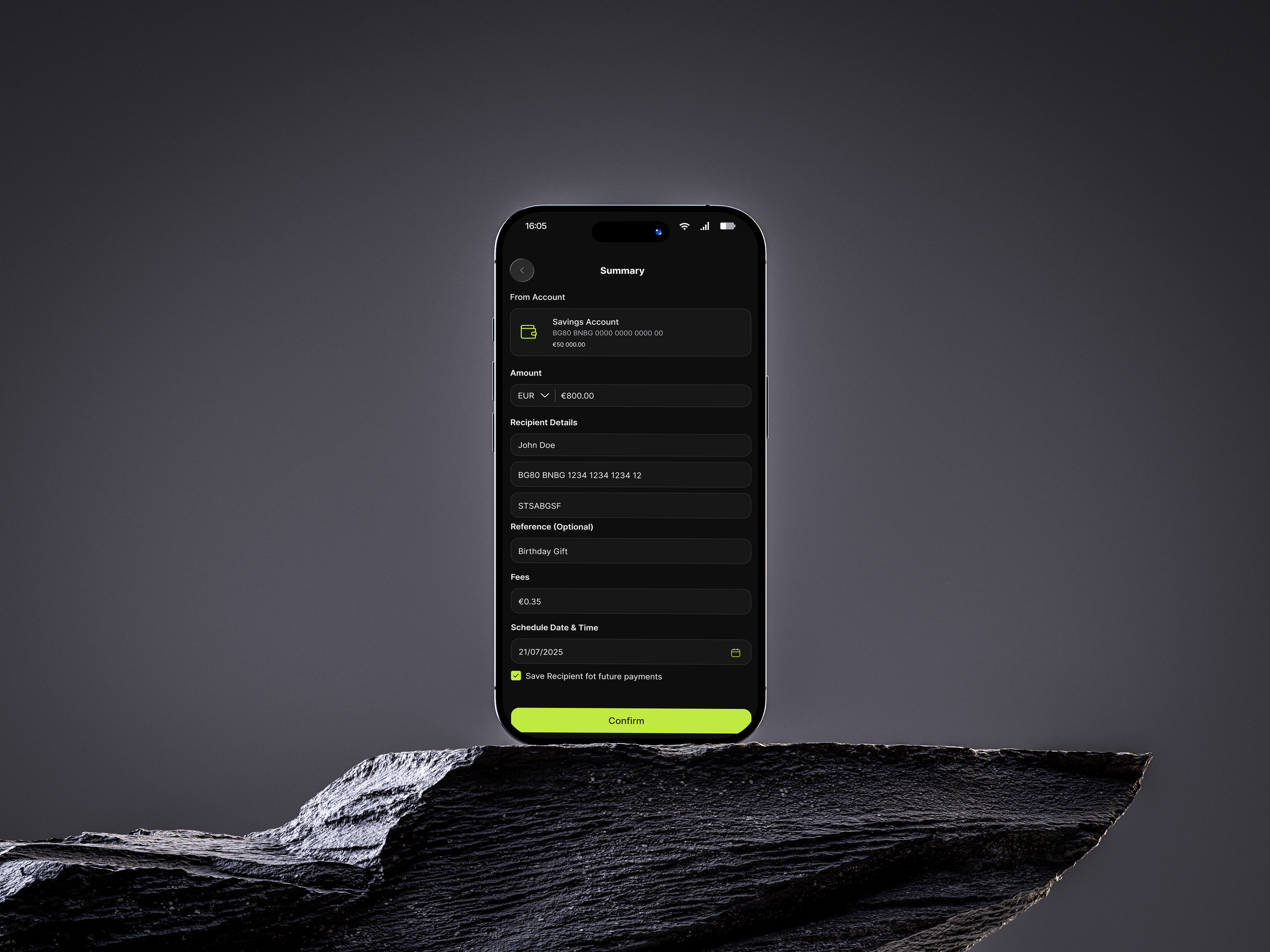
A full mobile app design encompassing onboarding, dashboard, card management, transfers, and integrated crypto and forex markets. Every interaction was designed to make complex banking feel simple, fast, and beautiful.
Problem &
Solution
"Users struggle with fragmented banking tools, complex interfaces, and no unified view of their finances - accounts, cards, spending, and investments live in separate apps."
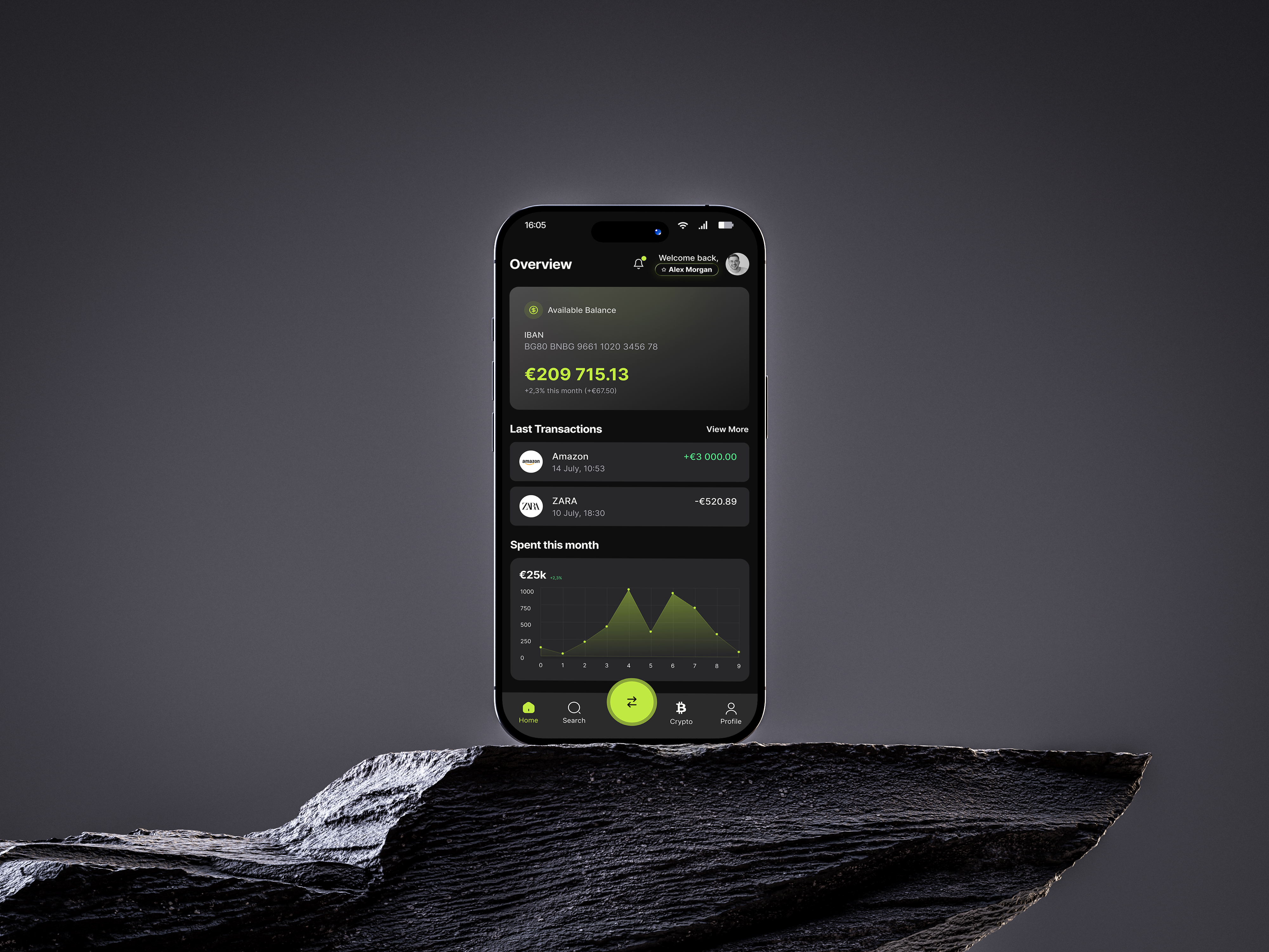
One dark-native interface combining accounts, cards, spending analytics, and market data - eliminating the need to switch between apps.
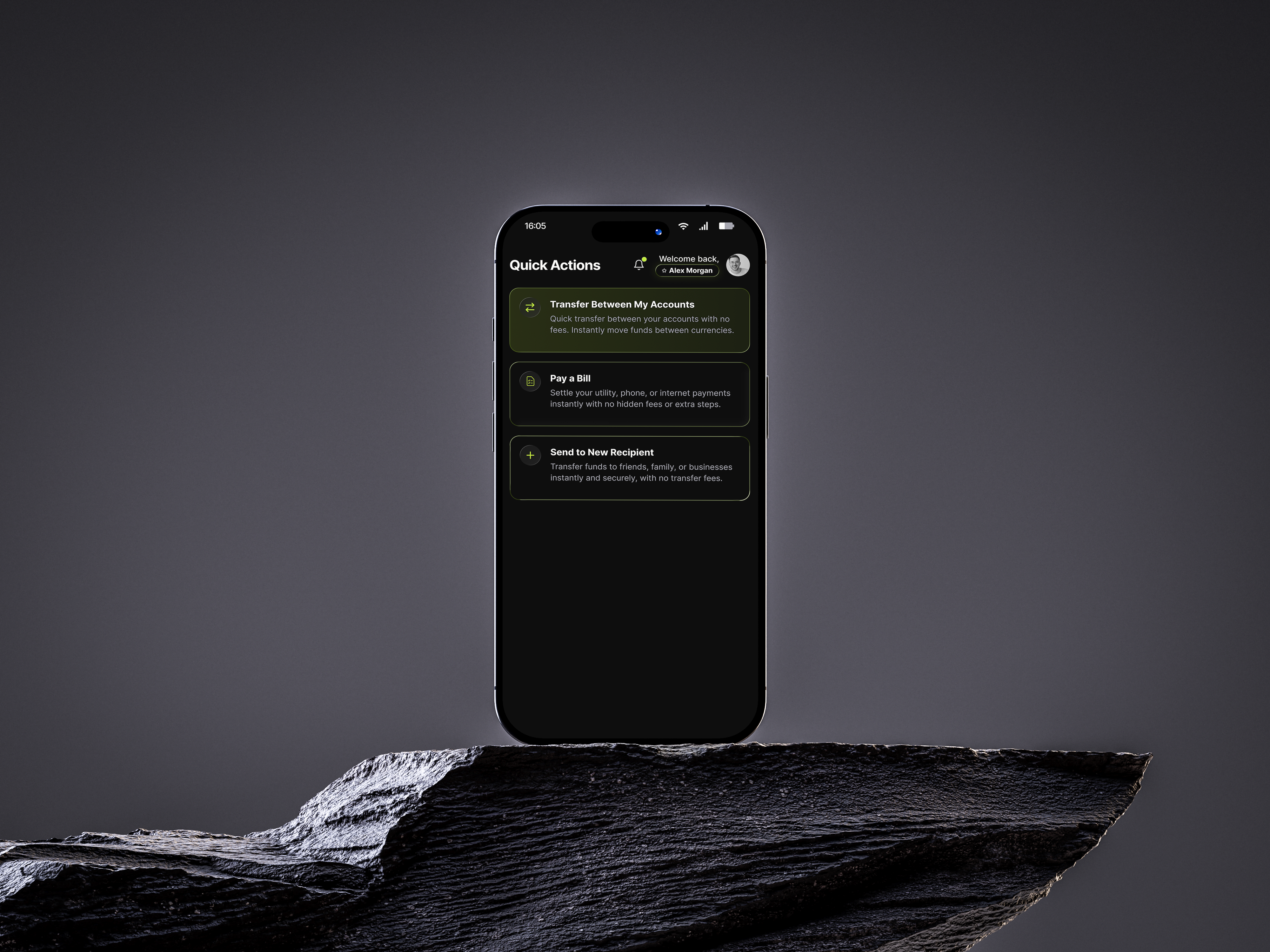
Critical operations - transfers, card freeze, top-up - accessible in a single tap, giving users instant financial control.

"The user doesn't need to be a finance expert. Volt handles the complexity - they just manage their money."
- USER RESEARCH
What the research revealed.
Three signals from the survey shaped the product before a single screen was drawn - sync, intelligence, and automation.
Said they want real-time syncing of expenses for better financial clarity.
Found AI-powered insights helpful in making smarter spending decisions.
Struggled with manual tracking; preferred automated categorization.
How we got there
We followed a structured process to move from research to delivery - each phase building on the last to reduce risk and keep the design grounded in real user needs.
Discover
Competitive analysis of 6 banking apps - Revolut, N26, Monzo, Wise, Cash App, Chime. Mapped recurring pain points: fragmented financial tools, overwhelming dashboards, poor onboarding.
Define
Built the information architecture and prioritized one-tap access to transfers, card controls, and market data. Defined 3 core user personas: casual spender, active investor, and power user.
Design
Created a dark-native design system with 8px grid, consistent spacing tokens, and a full component library in Figma. 12 key screens covering every critical flow.
Validate
Tested key flows with 5 users. Iterated on onboarding friction (reduced steps from 8 to 5) and dashboard hierarchy based on where users looked first.
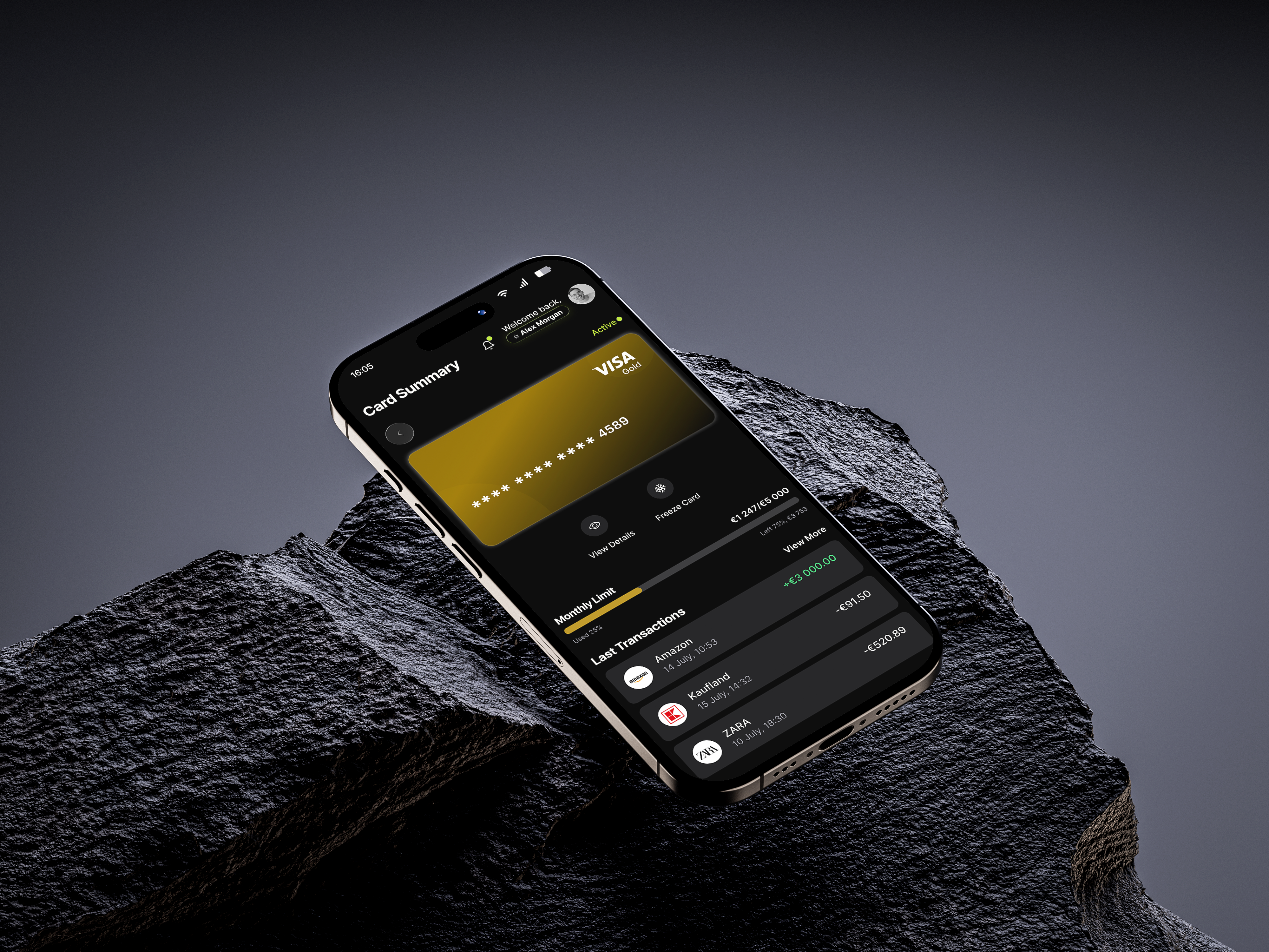
The tier on your screen matches the card in your wallet.
Designed for
clarity
Typography & Color
The visual system was built dark-first - not as an afterthought. Lime green (#BCE937) was chosen as the primary accent for its high contrast against dark surfaces and its association with growth and money, while avoiding the overused blue-on-dark pattern in fintech.
TYPEFACE
Aa
Inter
A purpose-built UI typeface optimized for screens - designed for high legibility at small sizes, making it ideal for data-dense banking interfaces.
Light 300
Regular 400
Medium 500
Semi-Bold 600
Bold 700
COLOR PALETTE
Primary - Volt Green
#BCE937
CTAs, accents, active states
Light Surface
#FFFFFF
Cards, inputs, overlays
Dark Surface
#000000
Backgrounds, modals
Neutral
#9CA3AF
Secondary text, borders
LOGO MARK

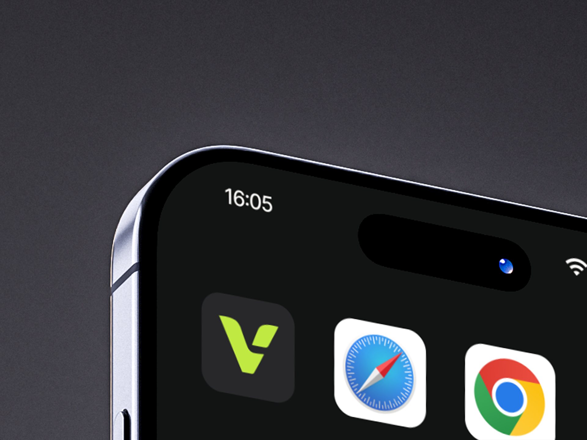
The mark holds its silhouette from app icon down to favicon - the lime V stays unmistakable on any dark surface.
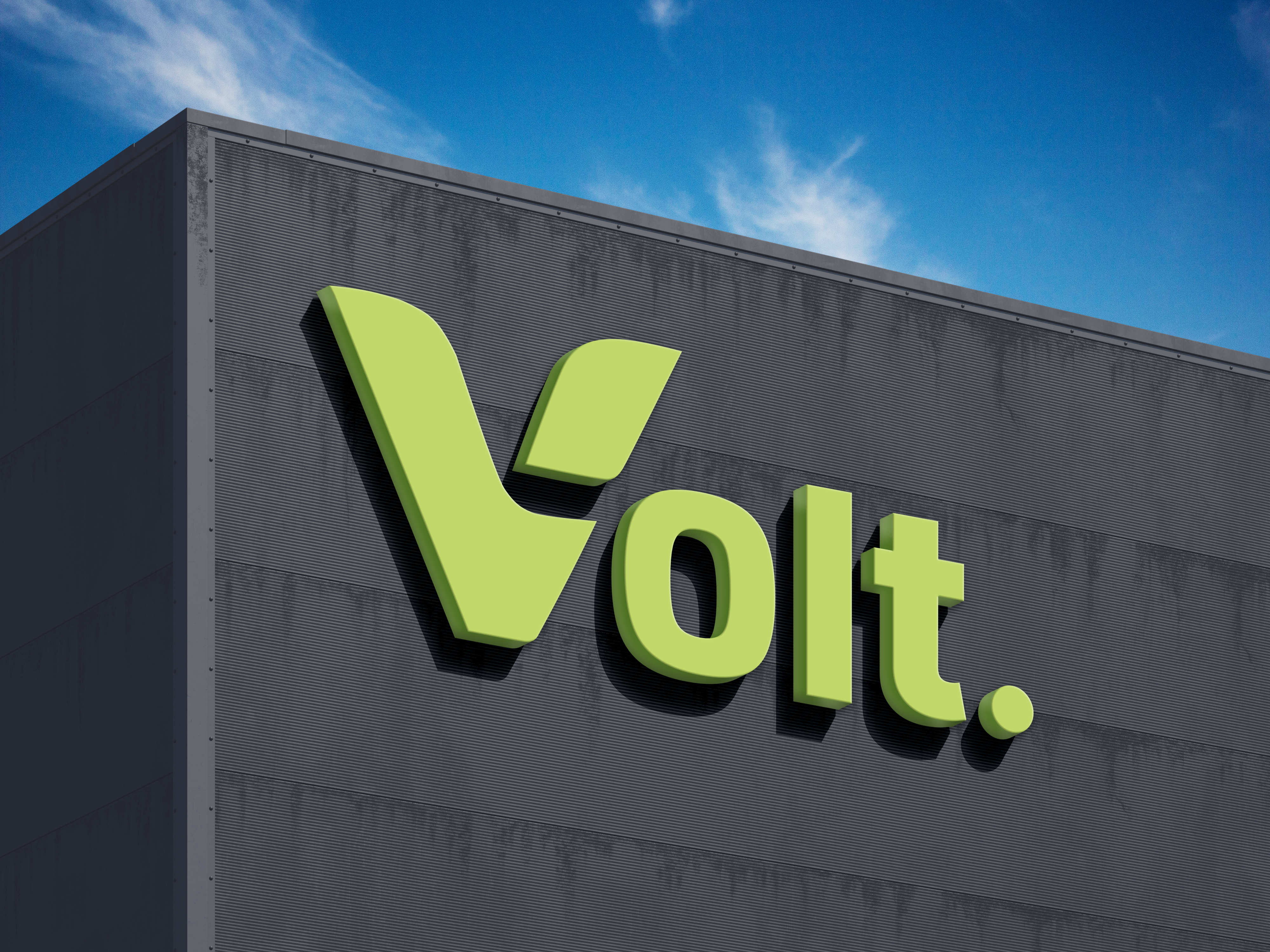
Lime strokes thick enough to read against bright sky.
One mark. Every distance.
A banking brand has to read from the highway and on a 30-pixel favicon - same recognition, same trust. Four surfaces, one rule book.
Two marks, one system
The full "Volt." wordmark for surfaces over 40px - signage, web, advertising. The V mark alone for app icons, favicons, inline UI. One brand, two heights.
Locked composition
Every campaign surface follows the same template - mark top-left, photography right, CTA bottom-left. The campaign feels like one piece in three frames.
Lime is reserved
#BCE937 only appears on the mark and the primary CTA. Never headlines, never body. Scarcity is what keeps it cutting through.
Photography direction
Real customers, lime accent garments, dark backgrounds - so the person never competes with the mark.
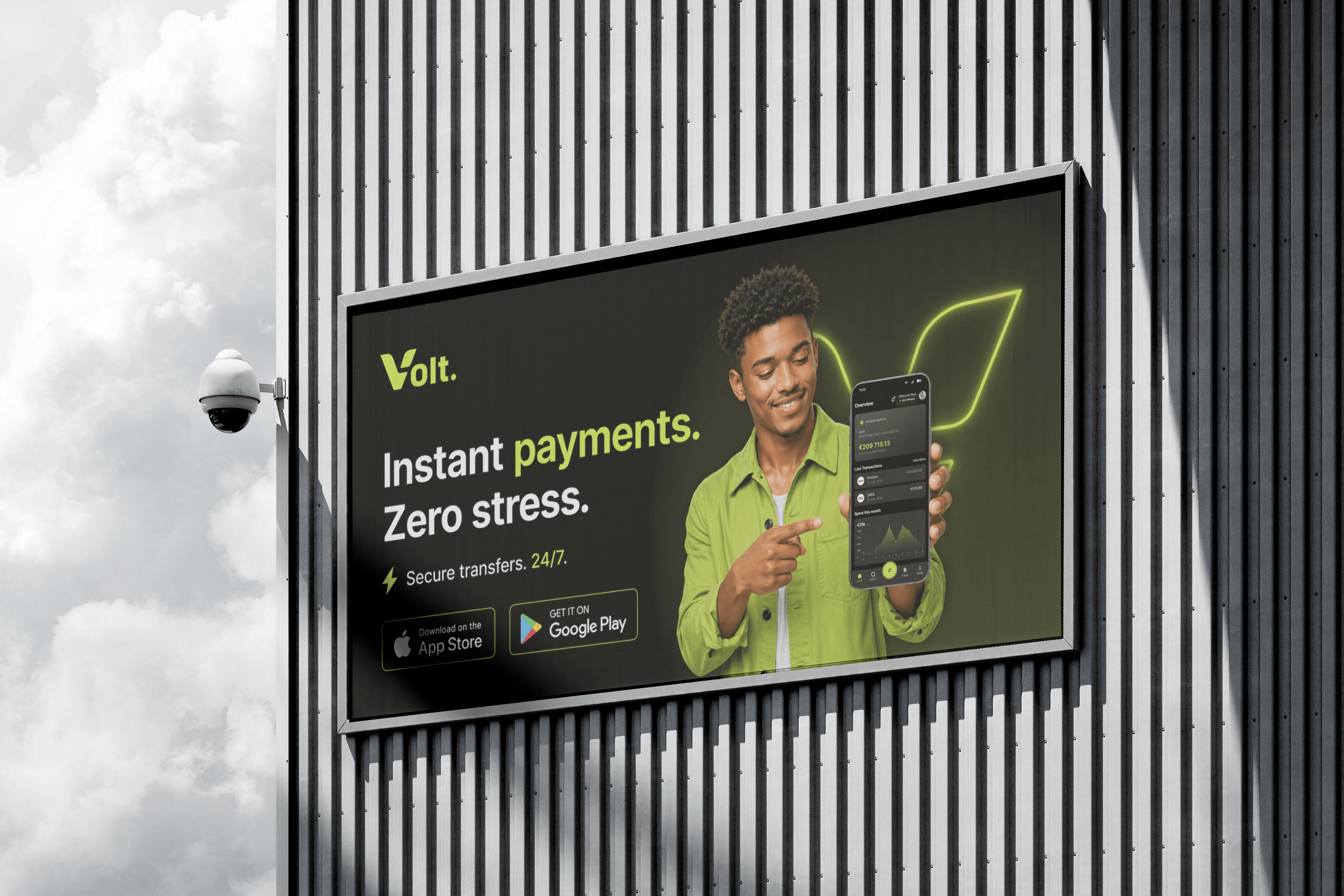
The rule-02 lockup at street scale.
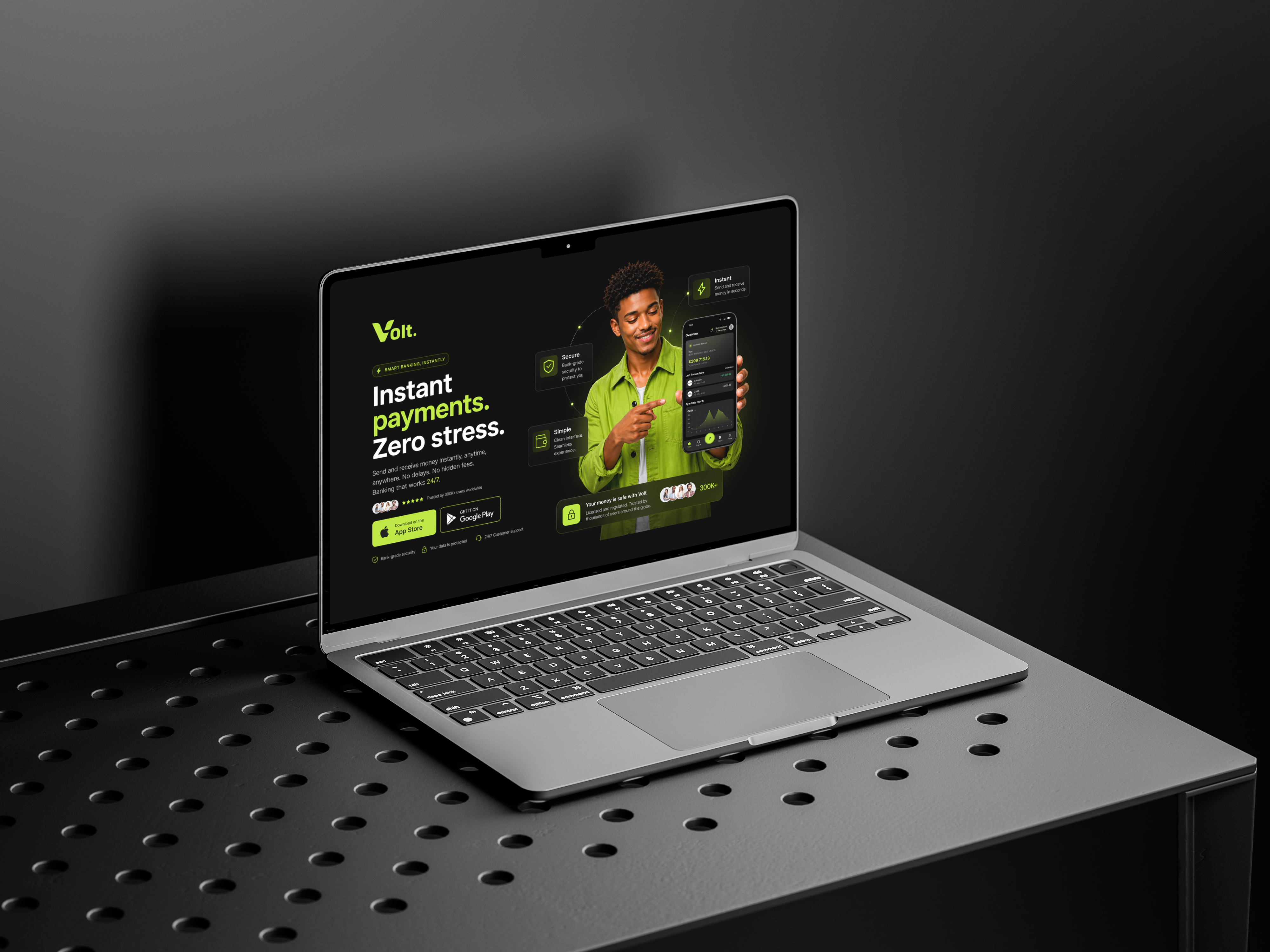
Same lockup as the billboard - only the CTA shifts.
Design choices
that mattered
Dark-First, Not Dark-Added
Most banking apps add dark mode as a toggle. Volt was designed dark from the start - UI components, contrast ratios, and color tokens were all built for dark surfaces first, then adapted to light.
Why: Reduces eye strain for frequent use. Feels premium. Saves battery on OLED.
Onboarding in 5 Steps, Not 8
Competitive audit showed an average of 8–12 onboarding steps. We collapsed KYC verification and account setup into 5 progressive screens with inline validation.
Why: Every extra step costs ~7% completion rate. Fewer steps = more users reach the dashboard.
Markets Inside Banking
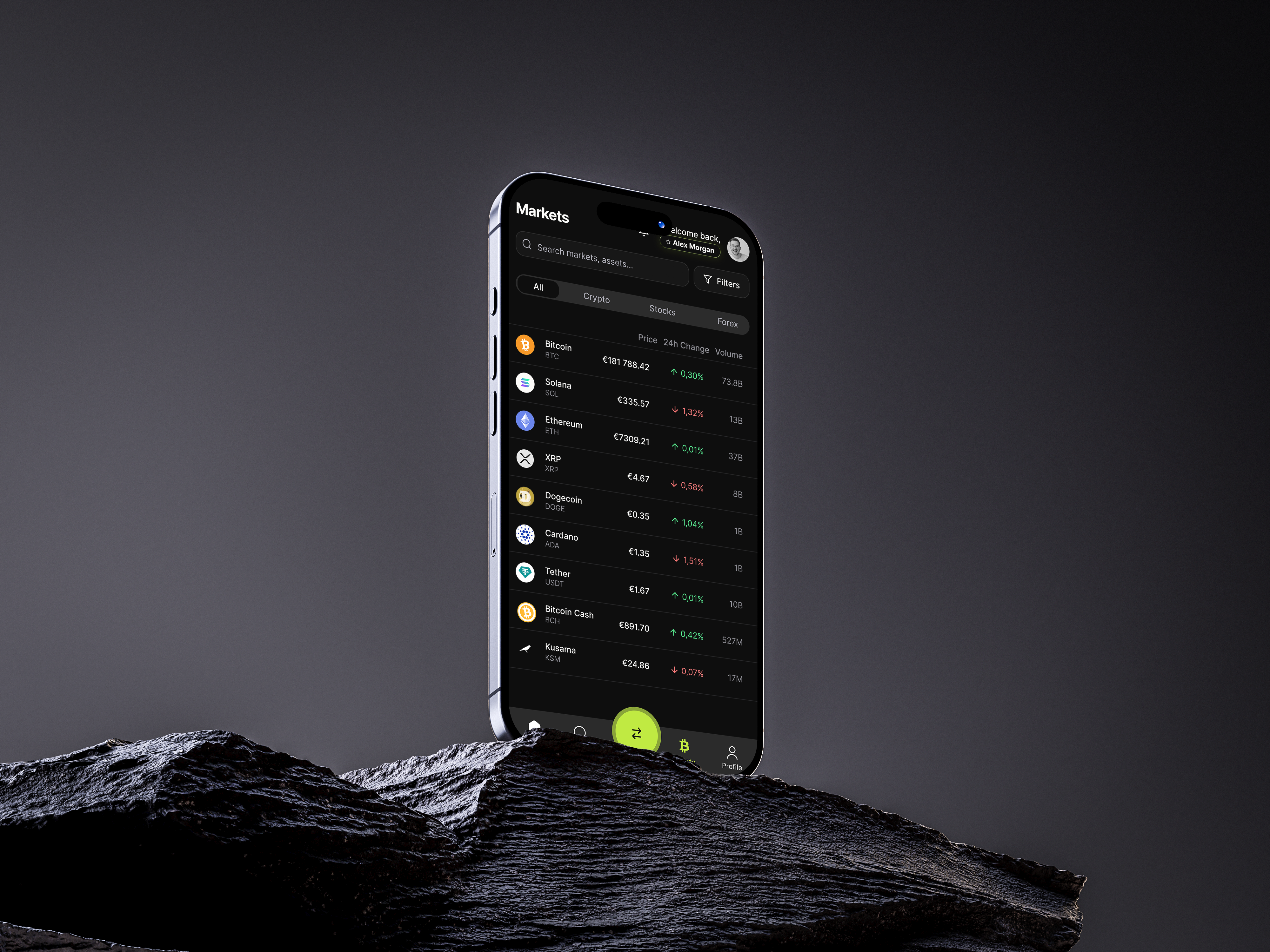
Rather than a separate investments section, crypto and forex data lives alongside the main dashboard. Users see market movements while checking their balance.
Why: The target user manages both spending and investments. Switching apps breaks flow.
Cards as First-Class Citizens
Card management isn't buried in settings - it's a primary tab. Freeze, limits, spending breakdown, and transaction history all accessible without drilling down.
Why: Card controls are the #2 most-used feature after balance check. They deserve top-level placement.