
FairyClean

Think Pink,
ThinkClean.

A full brand launch for a Bulgarian cleaning startup. Website, identity, digital advertising, and social - all in under two weeks.
The site.
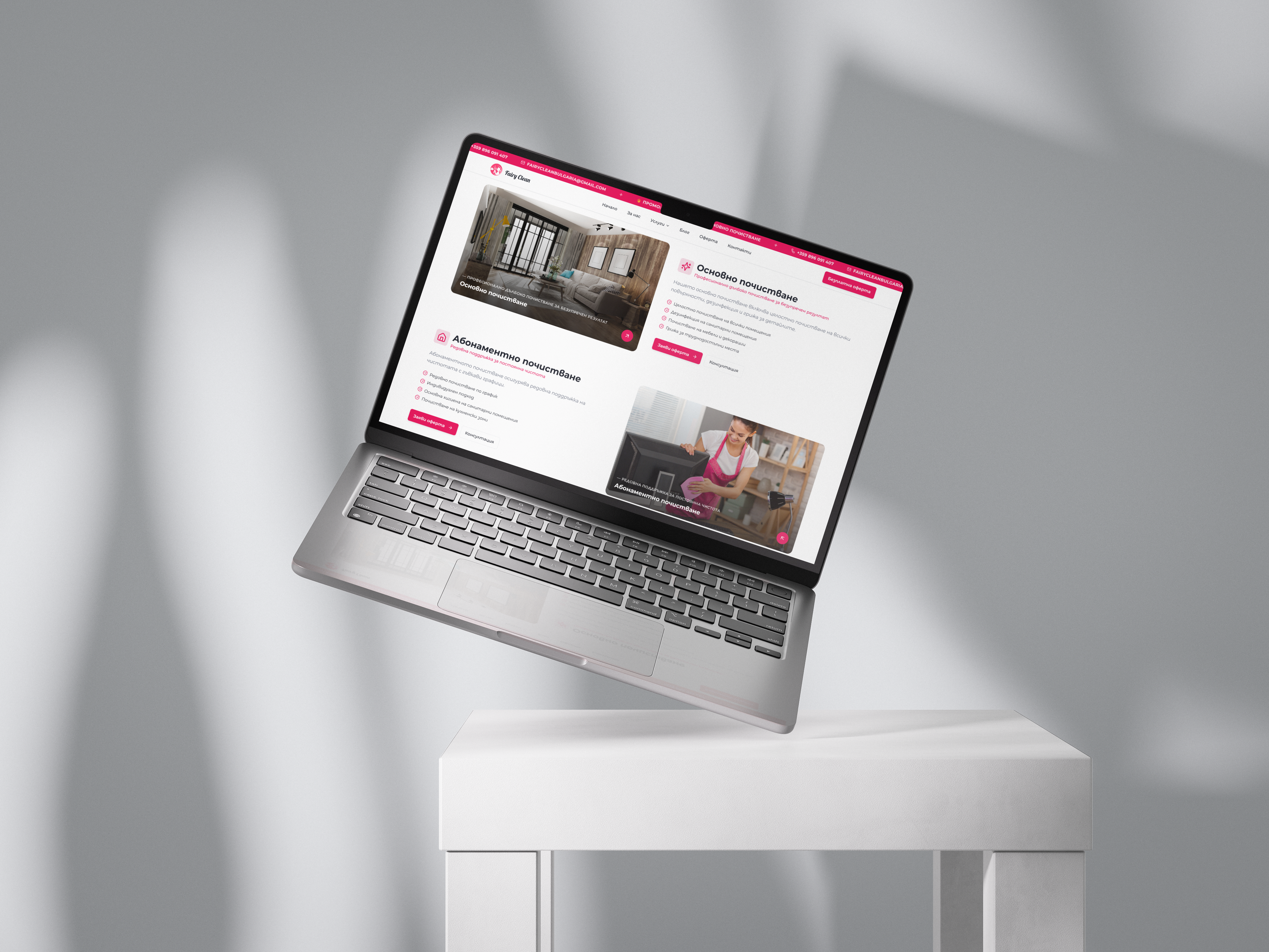
Built in Figma from scratch. A website designed to grab attention, build trust, and convert curious clicks into booked services.
Every page carries its weight - clarity, content, and conversion working as one.
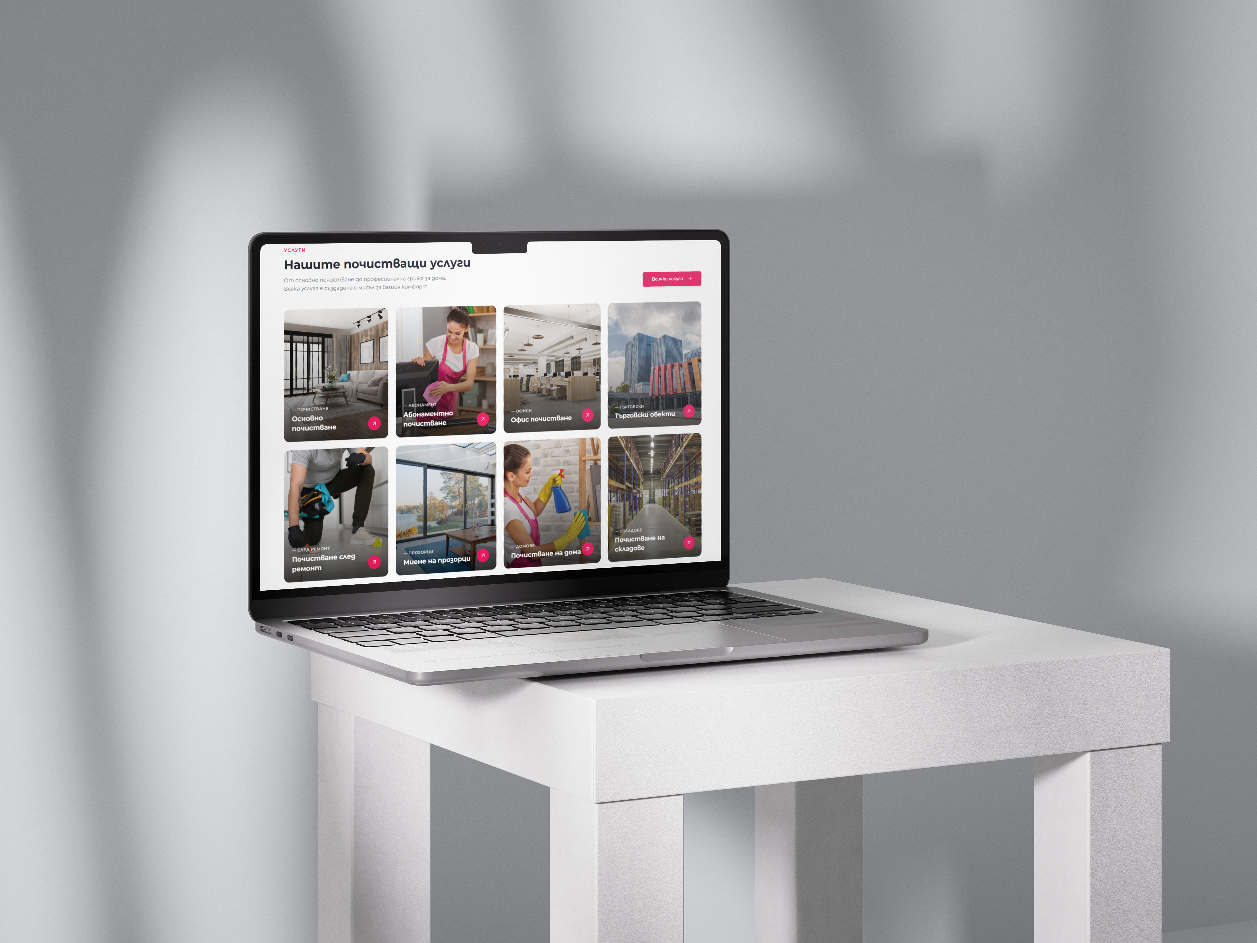
Clear Services
Every service presented with clarity - what it includes, how it works, and why it's worth booking.
Blog & SEO
Integrated blog driving organic traffic and keeping users coming back for more.
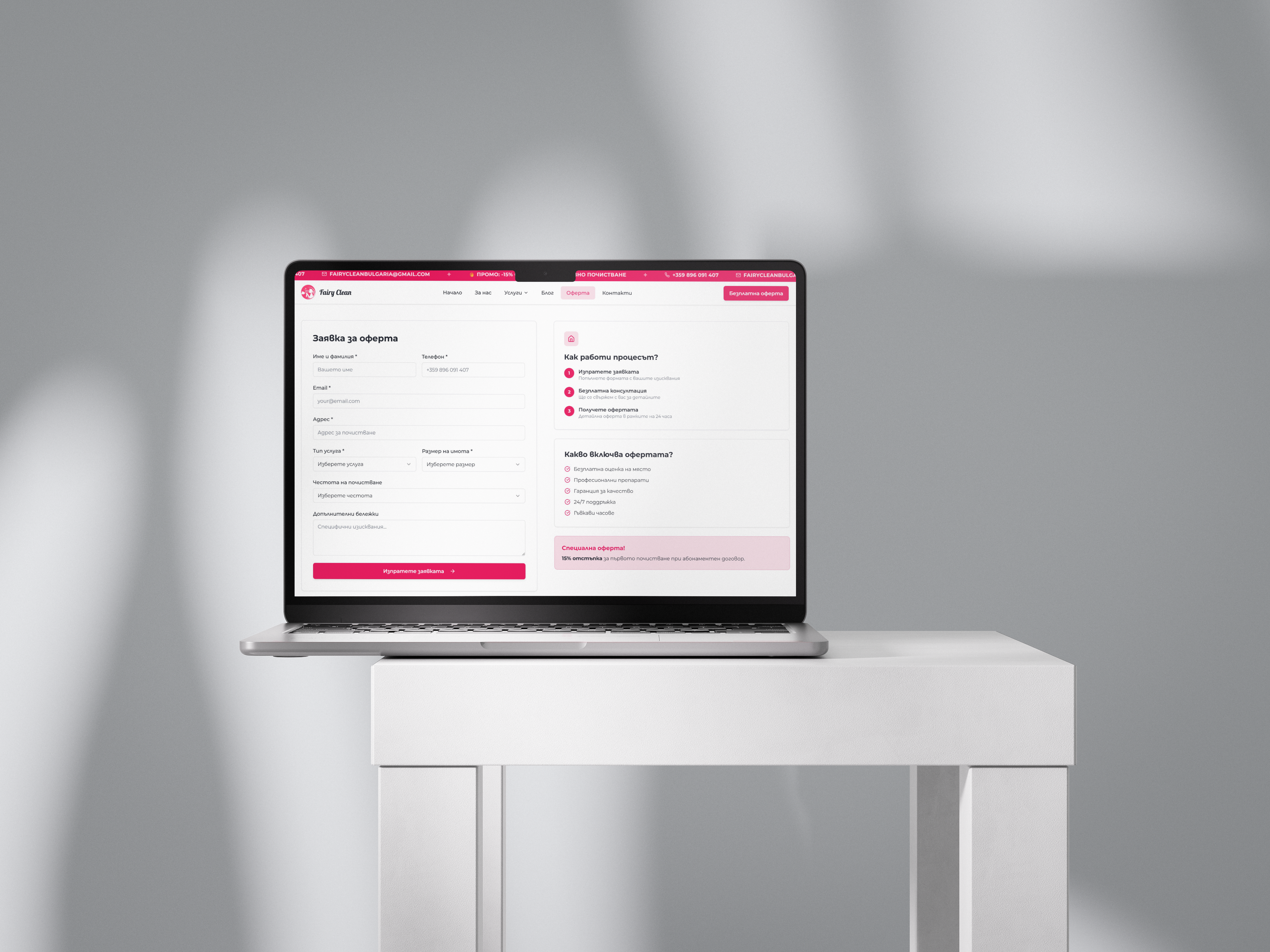
Fast Booking
Streamlined booking flow designed to turn visitors into paying customers.
Same industry.
Same look.
Every cleaning company in Bulgaria looks the same - blue logos, green accents, yellow highlights. Fairy Clean wanted to break the mold completely. They chose pink as their signature to stand out.
"How might we build a cleaning brand that breaks every industry convention - and launch it in under two weeks?"

Every post,
on brand.
Social creatives for Facebook and Instagram - one pink system, one voice, carried through every post.

.avif)
.avif)
.avif)
.avif)
.avif)
.avif)
.avif)
.avif)
.avif)
.avif)
.avif)


Every screen, designed.
When every competitor looks the same,being different is your biggest asset.