Smarter rides,simpler navigation.
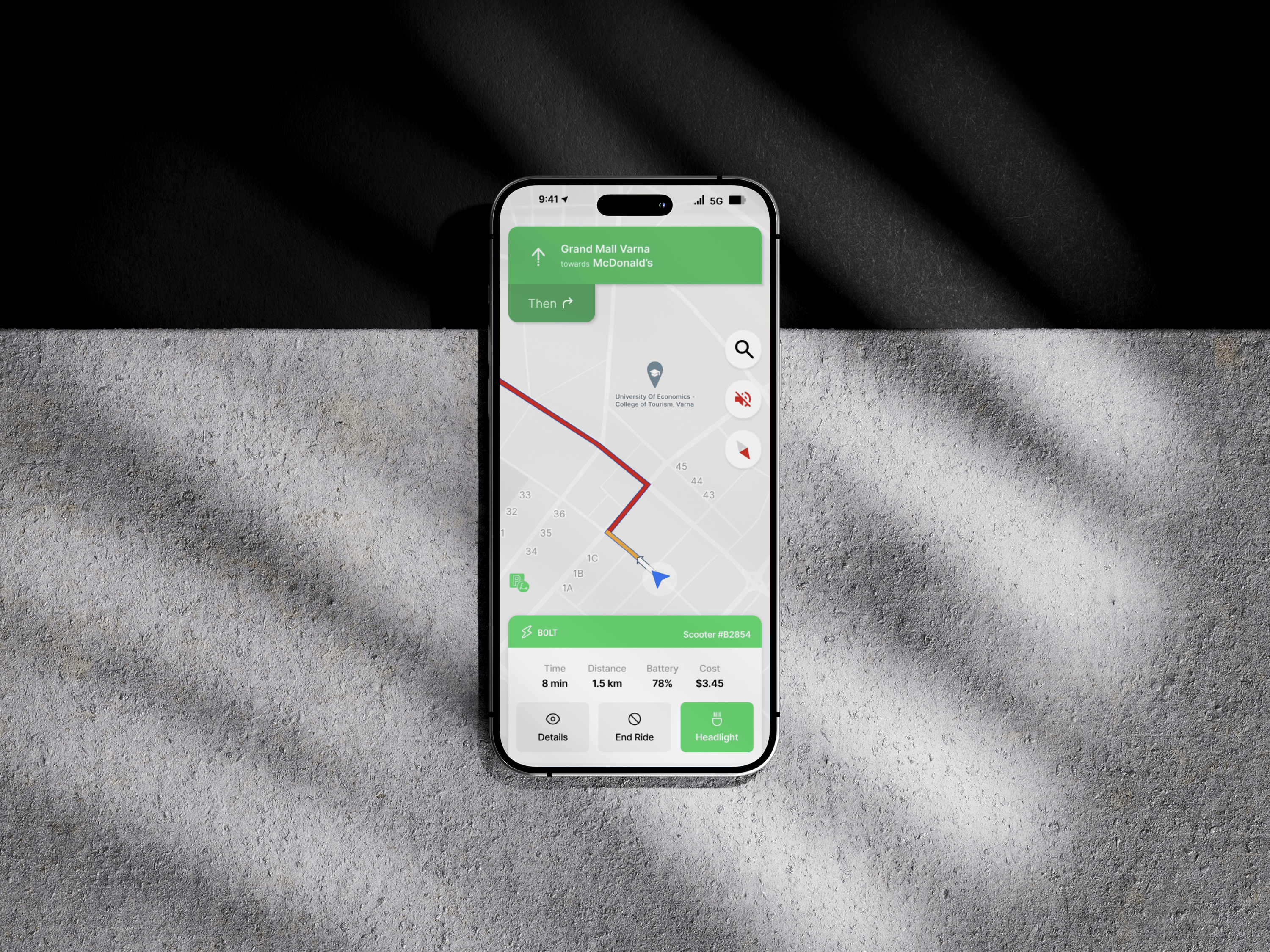
A contextual ride widget designed for Bolt scooters - surfacing live ride details, route info, and Google Maps navigation in a single, unobtrusive interface that keeps riders focused on the road.
The challenge: integrate Bolt's ride data with Google Maps Navigation mode without adding cognitive load - and design a promotional landing page that drives feature adoption.
Navigation while riding
is dangerous.
Bolt riders constantly switch between the Bolt app and Google Maps mid-ride - pulling out their phone, unlocking it, opening a second app, and trying to navigate. It's distracting, error-prone, and pulls attention away from the road.
The team needed a way to surface live ride details and turn-by-turn directions in a single contextual widget - without redesigning the entire Bolt app or creating something riders had to learn from scratch.
"How might we surface ride and navigation data inside a single, glanceable widget that doesn't compete for the rider's attention?"
Three principles of design.
Contextual
Show only what the rider needs at this exact moment - current ride status, distance, ETA, and next turn. Nothing else.
Glanceable
Information surfaced in 1 second or less. Bold typography, high-contrast color, and a single clear hierarchy at every state.
Frictionless
No taps required. The widget appears automatically when a Bolt ride starts and dismisses itself when the ride ends.
The widget, in motion.
A single, persistent ride widget that lives above Google Maps - combining Bolt ride state with turn-by-turn navigation in one unified interface.
From start to stop, in one screen.
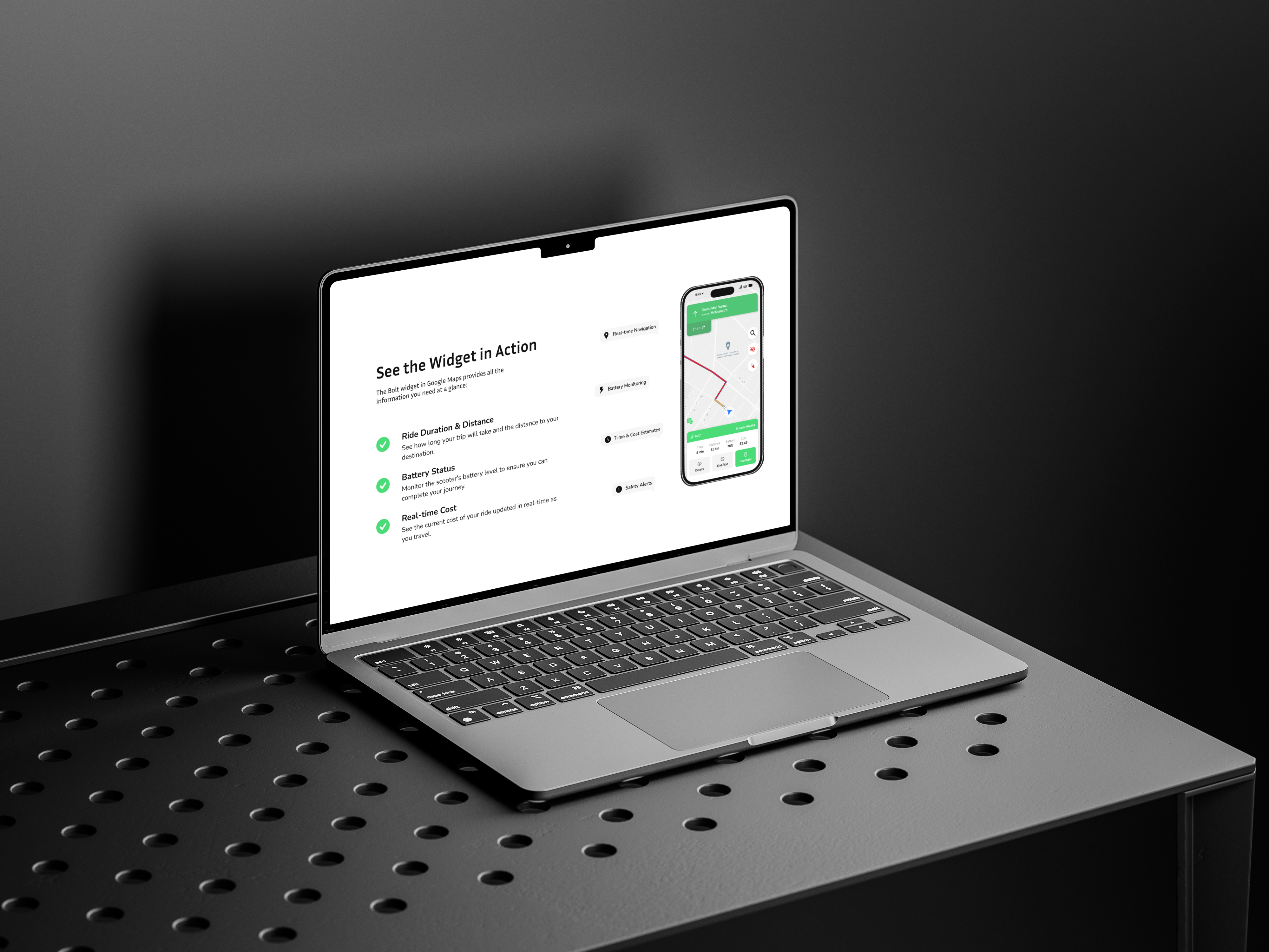
Distance, ETA, next turn.
One-Glance Hierarchy
The rider sees exactly three things: where they are, where they're going, and what to do next. Everything else is hidden.
Lock-Screen Native
The widget surfaces directly on the lock screen - no unlocking, no app-switching, no friction.
Auto-Dismissing
When the ride ends, the widget collapses gracefully into a summary card. The rider never has to dismiss it manually.
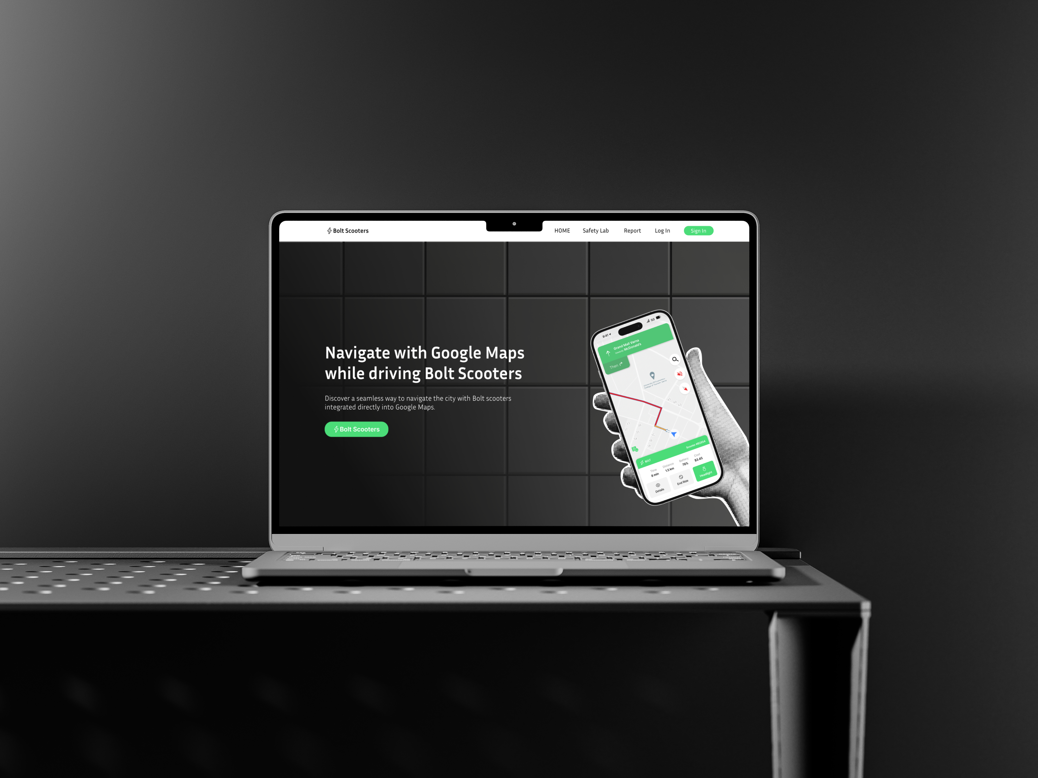
A landing page that drives adoption.
Riders can't use a feature they don't know exists. The promotional landing page introduces the widget, shows it in action, and walks new riders through how to enable it - all in under 30 seconds of scroll.
Awareness, designed.
Brand at street level.
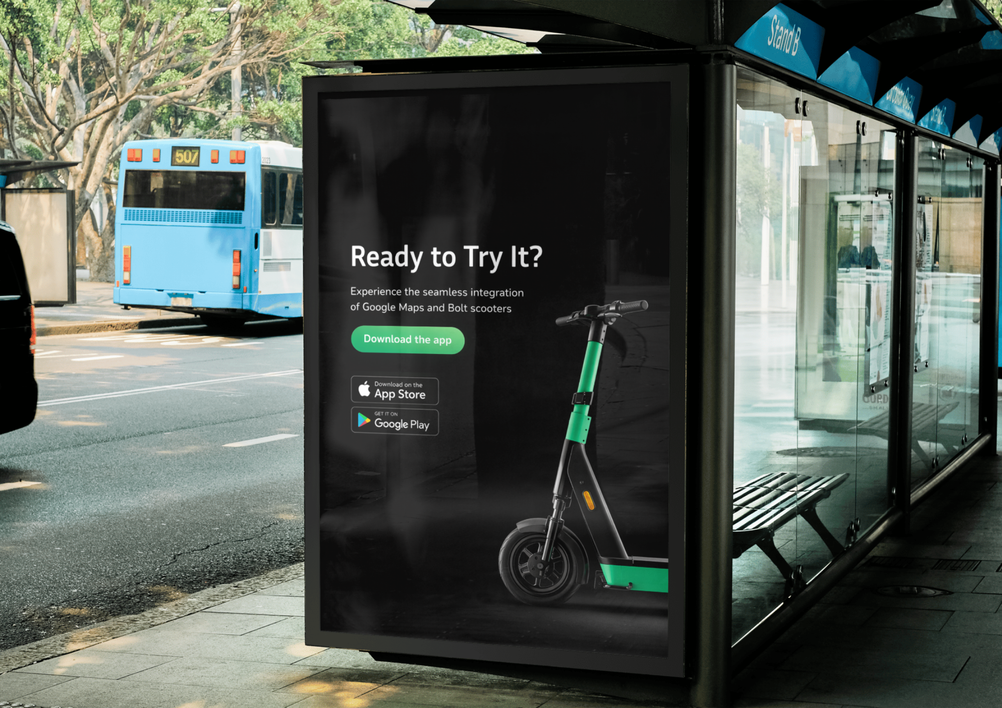
The widget, in the wild.
What we took away.
Design for the Glance
When a user is mid-action - driving, riding, walking - they don't read. They glance. Every design decision had to support a 1-second comprehension test.
Less is Literally Safer
In safety-critical interfaces, every removed element is a feature. The widget shipped with 30% less content than the first draft - and tested better at every iteration.
Awareness is a Design Problem
A great feature nobody knows about is a wasted feature. The promotional landing page mattered as much as the widget itself.
Case Study Disclosure+
The widget concept, interface design, typography, color palette, and visual system presented in this case study are our original design work - a self-initiated exploration of how a contextual ride widget could integrate with in-ride navigation, created as an independent design study.
The widget screens, ride flows, and promotional landing concepts shown here are part of the same self-initiated exploration - produced to demonstrate contextual UX thinking, interaction design, and surface-level integration craft. They are not reflective of Bolt's actual product or marketing materials; Bolt operates their own platform and Google Maps operates its own navigation product independently of this work.
This case study showcases design craft only - not product ownership, business claims, or commissioned deliverables. All trademarks and brand references (including Bolt and Google Maps) appear under fair use, for educational and portfolio purposes only. Nothing here implies affiliation, endorsement, or sponsorship.